India unveils new rupee symbol

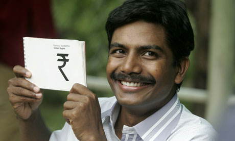
Udaya Kumar with his winning design for the Indian rupee symbol. Photograph: Strdel/AFP/Getty Images
It may look like a melted British Rail sign but it’s hoped that a new symbol for the Indian rupee will signal India’s growing economic strength ‑ and it will be coming soon to a keyboard near you.
The winning design was selected by the Indian cabinet yesterday from a shortlist of five following a national competition.
Measures are already afoot to have the rupee sign declared a computer standard, meaning it could join currencies such as the pound, dollar, euro and yen on keyboards within two years.
“The distinct symbol denotes the robustness of the Indian economy,” India’s information minister, Ambika Soni, said.
References to sums in rupees currently involve spelling out the word (as is the case in the Guardian’s style guide) or giving it the abbreviation Rs or INRs to distinguish it from other Asian countries that use rupees or variations thereof.
“Once accepted, it will stand clear from the clutter of currencies that call themselves rupee or the rupiah,” India’s Telegraph reported.
The winning symbol was the work of Udaya Kumar, a lecture in design at the Indian Institute of Technology in Mumbai. Speaking to the Indian news website Rediff.com he said: “My design is based on the tricolour, with two lines at the top and white space in between. I wanted the symbol for the rupee to represent the Indian flag. It is a perfect blend of Indian and Roman letters: a capital ‘R’ and Devanagari ‘ra’ which represents rupiya, to appeal to international audiences and Indian audiences.”
Michael Johnson, a director at the award-winning London-based design consultancy johnson banks, said the new symbol fitted with other currency signs but lacked imagination.
“I think it’s a B or B plus. Most currency symbols follow an established route now ‑ E for euro, Y for yen, now R for rupee. You could argue that a dynamic emerging economy could have gone for something more unusual and got away with it ‑ I think in the end conservative voices prevailed.”
Source : Guardian.co.uk
India unveils new rupee symbol
Government hopes to signal India’s growing strength with globally recognised currency symbol
- guardian.co.uk, Friday 16 July 2010 13.49 BST
- Article history
 Udaya Kumar with his winning design for the Indian rupee symbol. Photograph: Strdel/AFP/Getty ImagesIt may look like a melted British Rail sign but it’s hoped that a new symbol for the Indian rupee will signal India’s growing economic strength ‑ and it will be coming soon to a keyboard near you.
The winning design was selected by the Indian cabinet yesterday from a shortlist of five following a national competition.
Measures are already afoot to have the rupee sign declared a computer standard, meaning it could join currencies such as the pound, dollar, euro and yen on keyboards within two years.
“The distinct symbol denotes the robustness of the Indian economy,” India’s information minister, Ambika Soni, said.
References to sums in rupees currently involve spelling out the word (as is the case in the Guardian’s style guide) or giving it the abbreviation Rs or INRs to distinguish it from other Asian countries that use rupees or variations thereof.
“Once accepted, it will stand clear from the clutter of currencies that call themselves rupee or the rupiah,” India’s Telegraph reported.
The winning symbol was the work of Udaya Kumar, a lecture in design at the Indian Institute of Technology in Mumbai. Speaking to the Indian news website Rediff.com he said: “My design is based on the tricolour, with two lines at the top and white space in between. I wanted the symbol for the rupee to represent the Indian flag. It is a perfect blend of Indian and Roman letters: a capital ‘R’ and Devanagari ‘ra’ which represents rupiya, to appeal to international audiences and Indian audiences.”
Michael Johnson, a director at the award-winning London-based design consultancy johnson banks, said the new symbol fitted with other currency signs but lacked imagination.
“I think it’s a B or B plus. Most currency symbols follow an established route now ‑ E for euro, Y for yen, now R for rupee. You could argue that a dynamic emerging economy could have gone for something more unusual and got away with it ‑ I think in the end conservative voices prevailed.”

